Birdie Juice
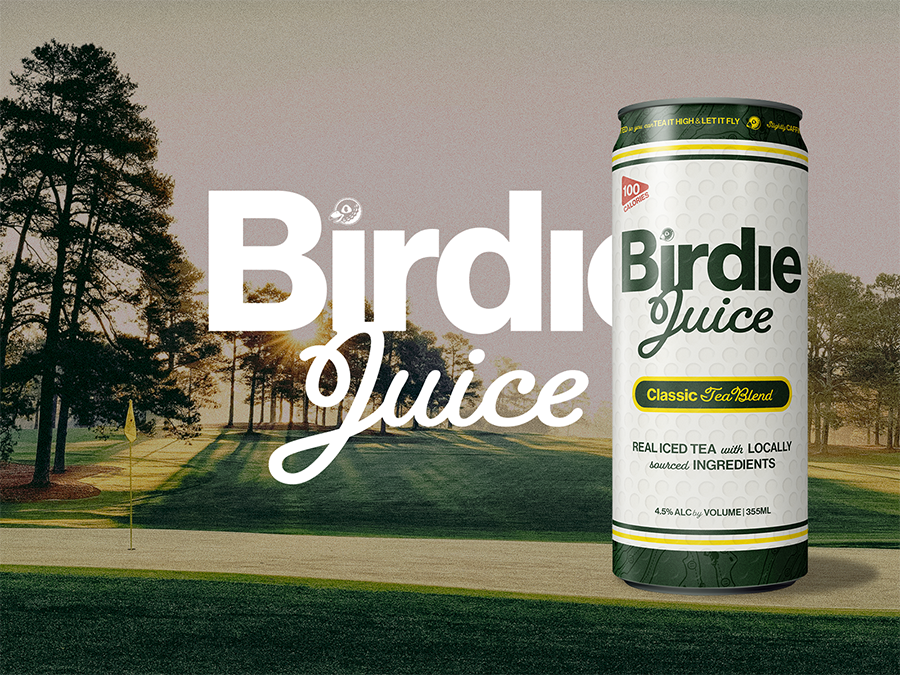
The founders of Birdie Juice set out to create the ultimate "on-the-course" beverage. The mission was to develop a hard seltzer brand that felt synonymous with the game of golf itself—merging the sport’s classic, prestigious aesthetic with a playful, approachable energy perfect for the 19th hole and beyond.
Purpose & Vision
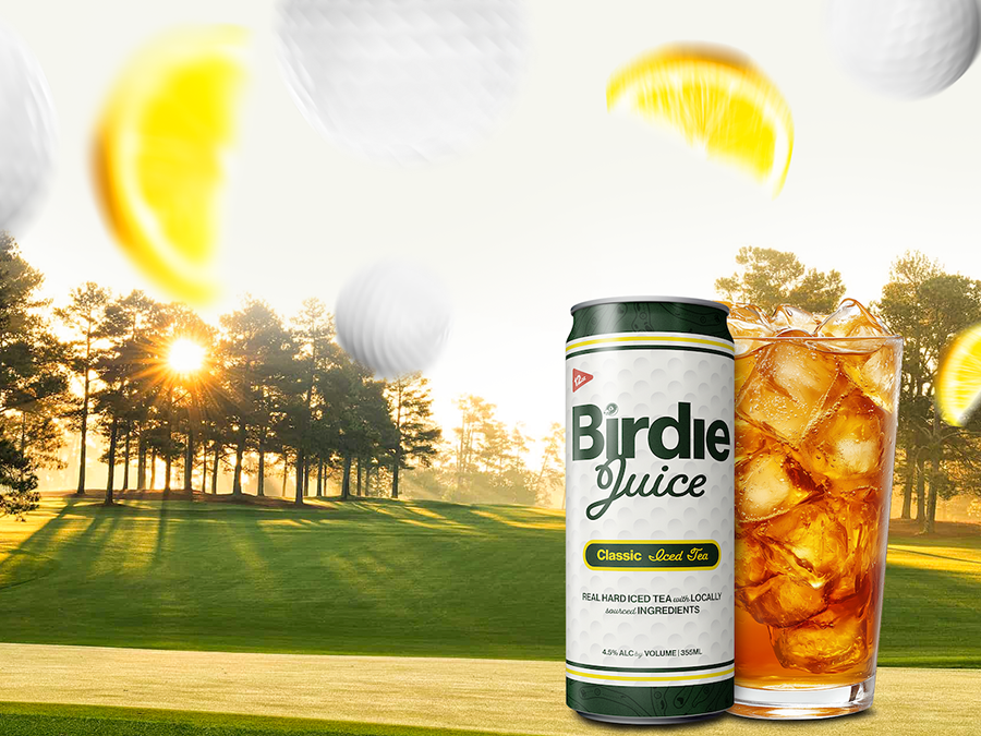
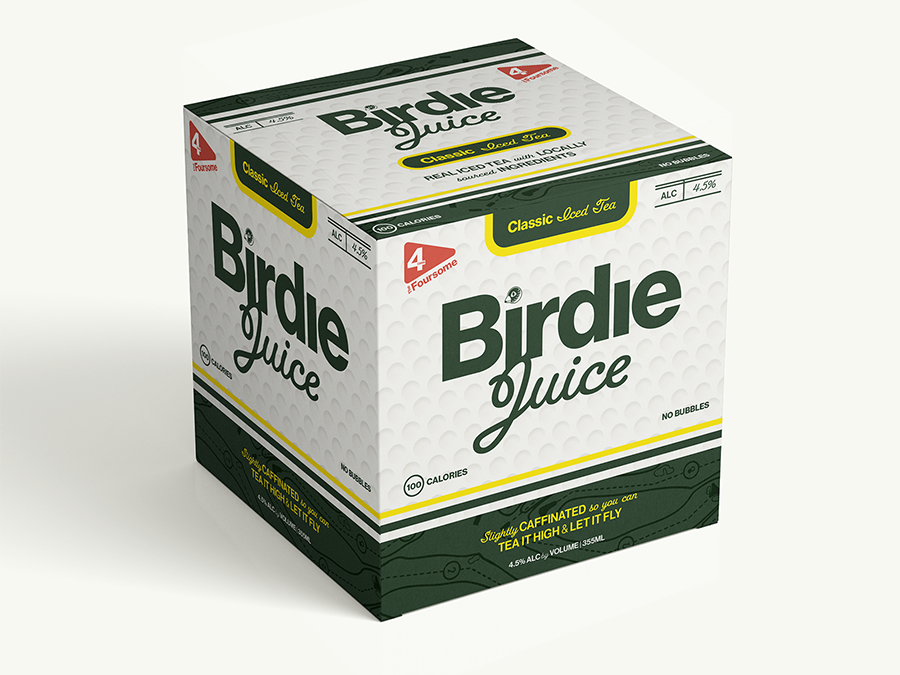
Our objective was to "hide golf in every corner" of the brand, creating an immersive experience for enthusiasts without sacrificing modern shelf appeal. We balanced nostalgia with a bold, clean design system across three key touchpoints:
- Packaging: We utilized a unique golf-ball-textured finish for the cans to create a physical connection to the sport.
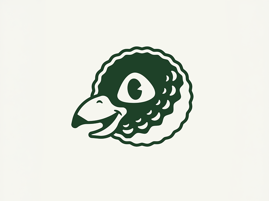
- The "Birdie" Icon: A clever fusion of a bird and a golf ball, designed to serve as a versatile, recognizable mascot for future lifestyle apparel and marketing campaigns.
- Thematic Details: Every element was an opportunity for storytelling—from the "Course Map" brand pattern to the "Scorecard" nutritional facts panel.
- Strategic Color Palette: We curated a timeless palette that evokes manicured fairways and classic clubhouses, engineered for high contrast and scalability as new flavor profiles are introduced.
Impact & Growth
The result is a cohesive, "lifestyle-first" beverage brand that stands out in a crowded seltzer market. By leaning heavily into golf culture through tactile design and witty easter eggs, Birdie Juice successfully established immediate brand loyalty within the golf community. The scalable visual identity has allowed for a seamless rollout across social media, event activations, and point-of-sale displays, positioning Birdie Juice as the premier choice for the modern golfer.